MPS lets you customize the empty (placeholder) cell for any optional link, that is the cell that shows some gray text
like no propertyValue or simply << ... >>. You generally want the custom placeholder to look just like the default
one, except you may need to set a custom menu or change the default text to something more user-friendly.
So you create a constant cell and specify its text. But by default this text is drawn in bold black and it looks out of place. The next thing you do is adjust the text with a style but you still feel like something is off about that cell.
What you probably have noticed is that the default cell has a placeholder text that is just that, a placeholder. The
caret can only be put at the beginning of the text and you can’t select this text. If you press Right to go to the
right, you’ll jump to the next cell immediately. This is not what happens with the default constant cells. So how do you
make your custom cell behave exactly the same as the default one? Is it even possible?
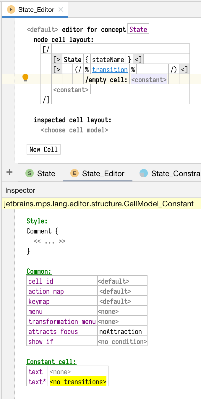
The “trick” is actually very simple. Every constant cell has two properties: text and text*. The text* is the placeholder that is shown when the actual text is empty. Instead of typing your placeholder text in the main editor you leave it empty and specify the text* in the inspector.
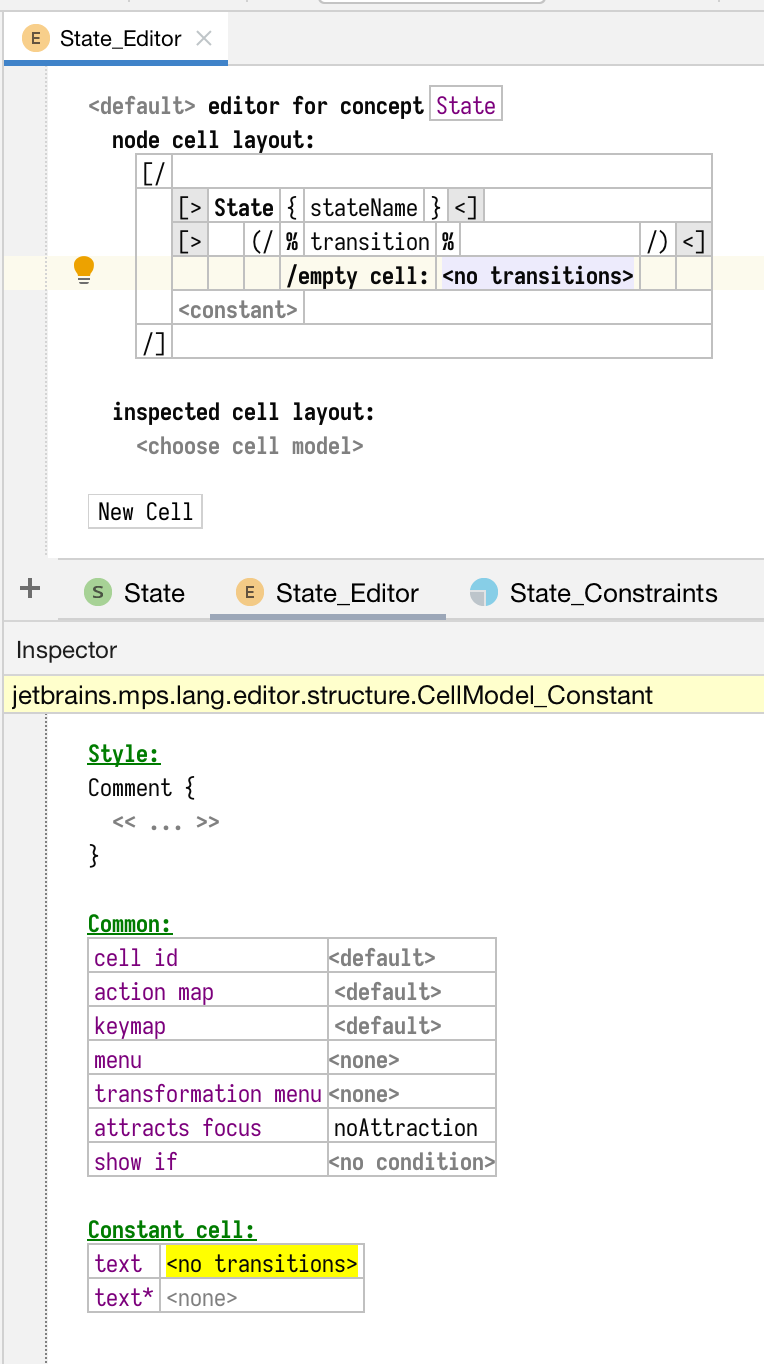
This incorrect definition:

Wrong definition
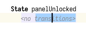
will give you this result:

Wrong result
I used the Comment style to make the placeholder text stand out less than the default bold black but note that you can select part of the text.
If you use text* instead:

Better definition
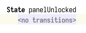
then the placeholder will look like this:

Better result
and will have the default style and behavior without me having to specify anything extra.